A bold, brand-aligned visitor guide that translated a high-impact campaign aesthetic into a readable, multi-page publication.
This approach reinforced Pittsburgh’s new brand identity, capturing its bold, energetic personality while creating a cohesive and engaging reader experience.
Overview
& Scope
Visit Pittsburgh
CLIENT
Redesign Strategy, Editorial Design, Spec Work
CONTRIBUTIONS
Develop visitor guide mockups that aligned with the newly launched destination branding for Pittsburgh, translating a bold campaign aesthetic into a functional multi-page print publication.
OBJECTIVE


Challenges
Translating Bold Branding into Long-form Print
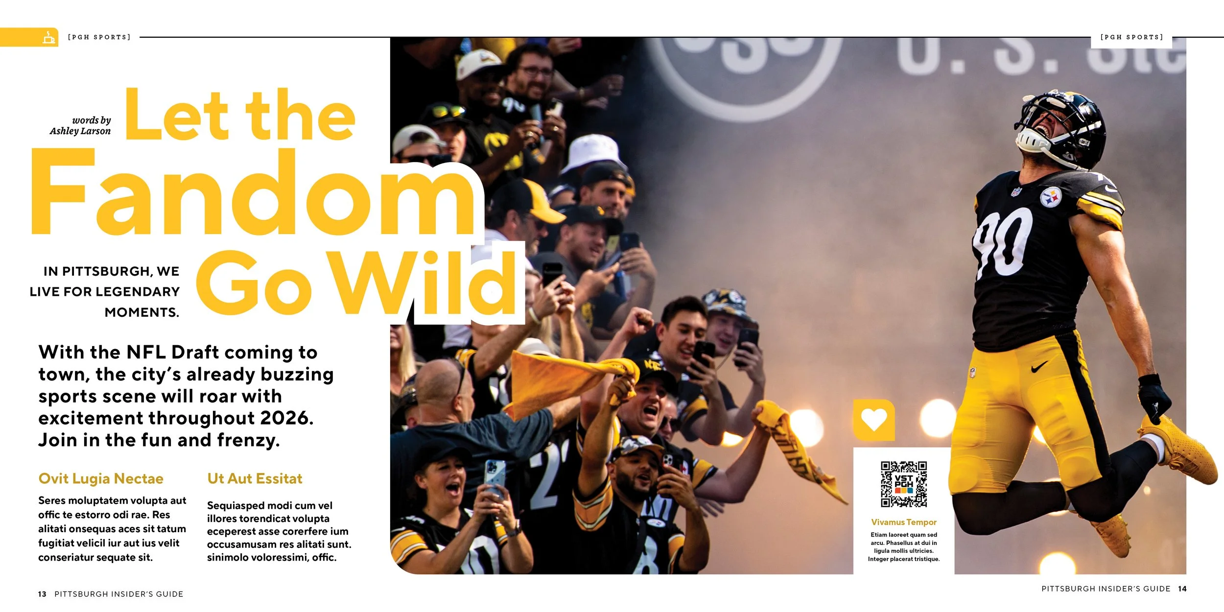
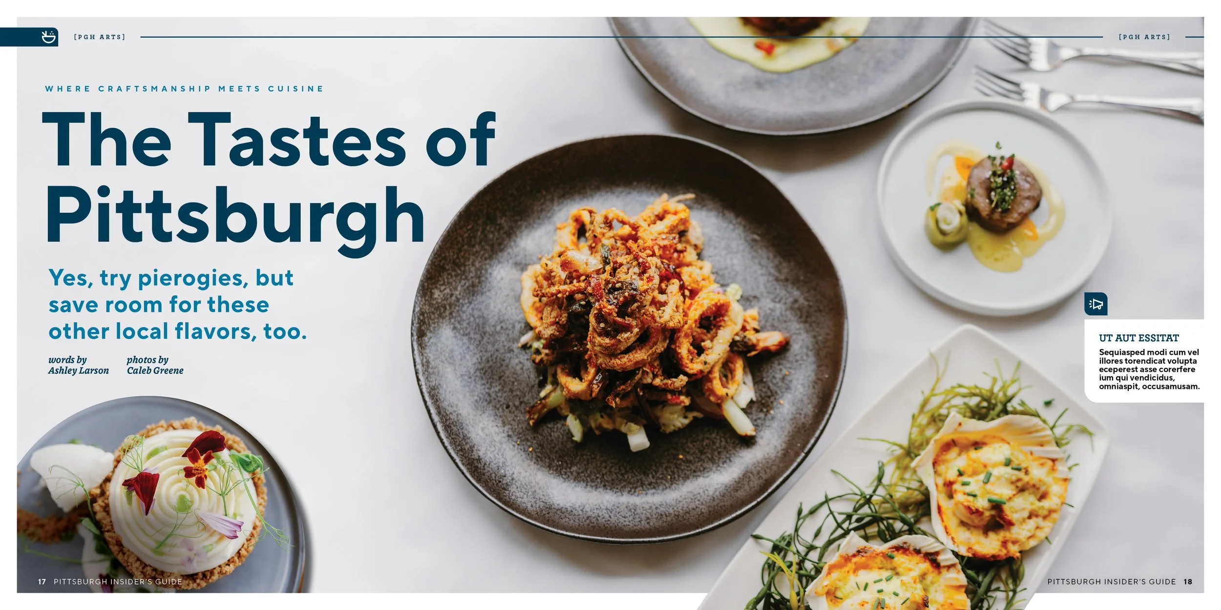
The new creative direction featured highly saturated primary colors, heavy sans-serif typography, and graphic grids that needed to be adapted into a format that remained readable and comfortable across many pages.
Advertorial Distinction with Brand Consistency
Advertorial sections required their own visual identity to clearly signal paid content, while still feeling cohesive with the overall destination branding system.

Approach
Integrated Grids as Functional Design Elements
Rather than using graphic grids as purely decorative elements, I strategically designed to interact with photography, headlines, and body content to enhance hierarchy and visual flow.
Complementary Advertorial Design System
I developed a distinct yet brand-aligned layout style for advertorials using consistent typography, color cues, and structure to differentiate them from editorial pages while maintaining visual cohesion.


Results
The mockups successfully translated the destination’s bold new brand into a dynamic, reader-friendly publication format that balanced energy with usability.
The project also established a clear visual framework for advertorial content that supported both brand integrity and advertiser visibility.
View More Featured Work
-
![]()
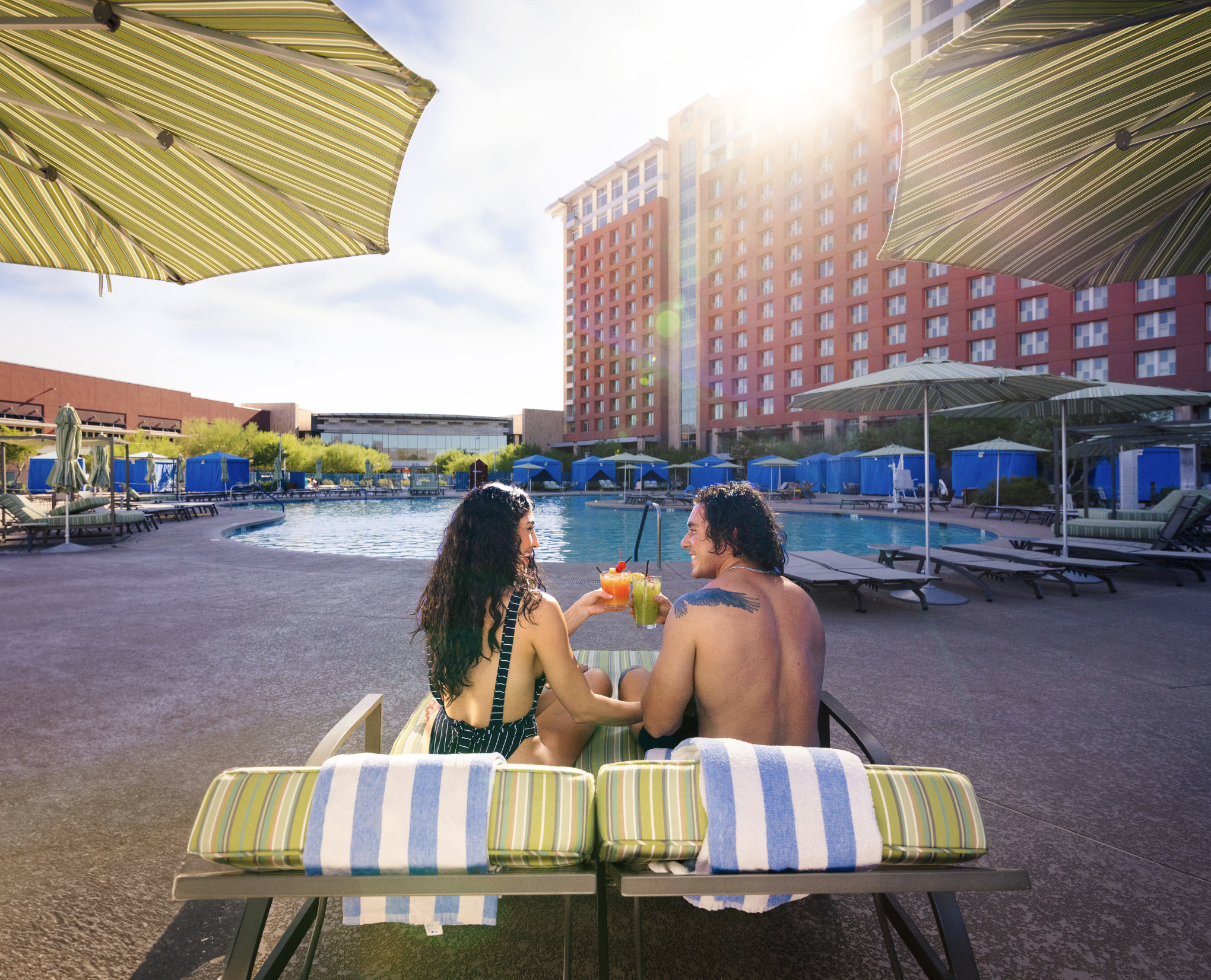
Discover Salt River
Editorial Design, Redesign Strategy
-
![]()
Sidepiece Magazine
Creative Direction, Production Management, Advertising Strategy, Social Media Strategy, Event Planning
-
![]()
Hardware Retailing
Editorial Design, Marketing Design, Branding, Creative Direction, Social Media Strategy, Photography
-
![]()
Pattern Magazine
Creative Direction, Editorial Design, Photography, Styling, Digital Content Management
-
![]()
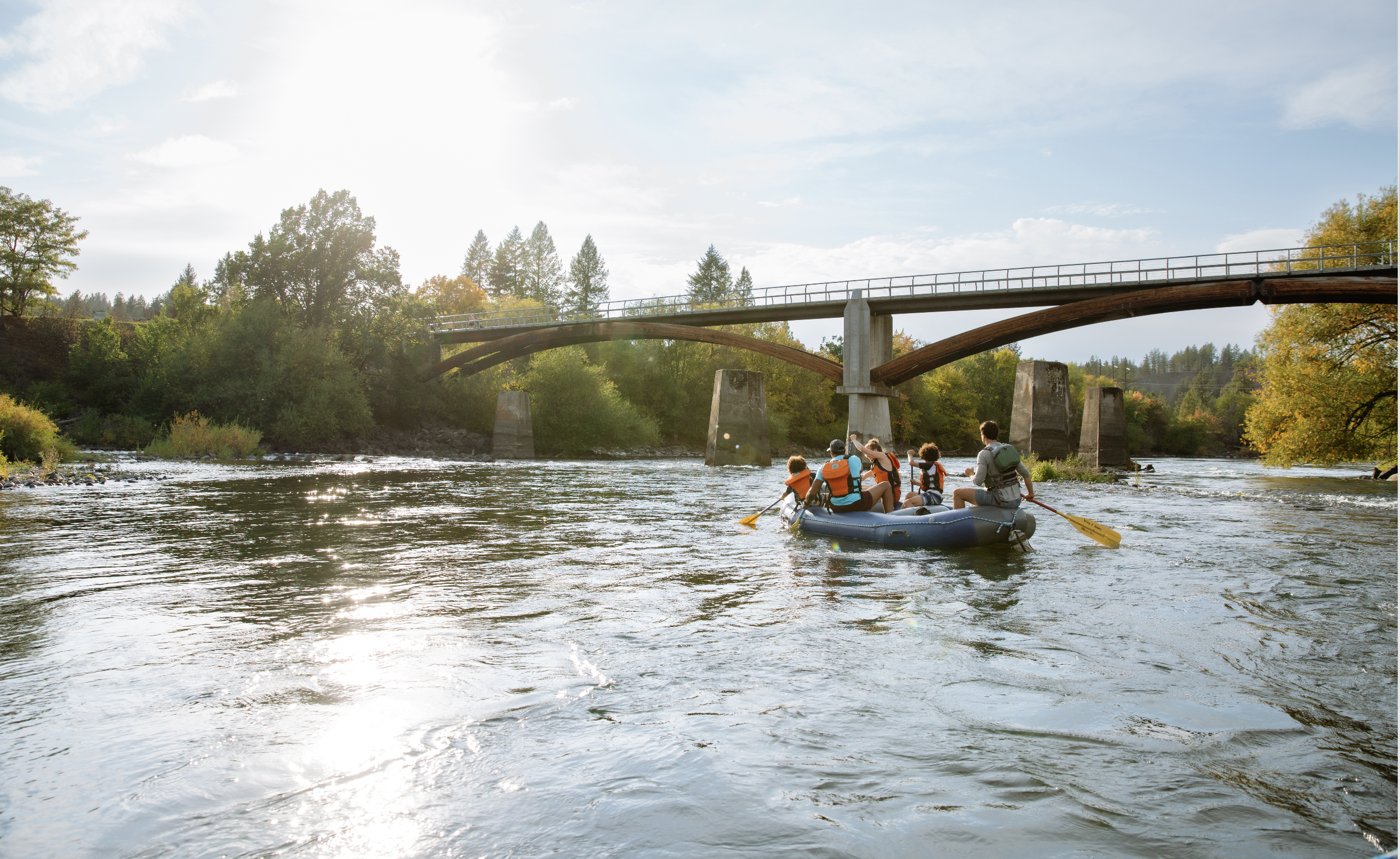
Visit Duluth
Art Direction, Editorial Design, Redesign Strategy, Editorial Strategy
-
![]()
Visit Phoenix
Art Direction, Editorial Design, Redesign Strategy
-
![]()
Visit Tampa Bay
Editorial Design, Redesign Strategy
-
![]()
Visit Missouri
Editorial Design, Redesign Strategy
-
![]()
City of La Quinta
Editorial Design, Branding, Editorial Strategy
-
![]()
Explore Branson
Art Direction, Editorial Design, Editorial Strategy, Brand Refresh
-
![]()
Northwest Arkansas
Art Direction, Editorial Design, Branding, Redesign Strategy
-
![]()
Destination Door County
Art Direction, Editorial Design, Redesign Strategy, Editorial Strategy, Marketing Strategy
-
![]()
Visit Washington State
Editorial Design, Redesign Strategy
-
![]()
Visit Laramie
Editorial Design, Redesign Strategy
-
![]()
Visit Pittsburgh
Editorial Design, Redesign Strategy